Before I show off the final design that has been painted I thought Id share the thought process I went through to get me there. This was not something that happened over night, Deciding the final paint colour this took over 4 years to decide,when I thought it may be a good idea to have a graphic on the van this took about 2 years to workout and was only finalised just before it was painted on the van.
Here is my previous entry about deciding the paint colour
http://paulssplit.blogspot.co.uk/2010/08/paint-color-trial.html
I had previously trialed a black over gold but I felt the gold was to modern and may date quicker than a more classis colour combo.
So I kept an eye out for the classic look I was after, I noticed there was a lot of new cars starting to use the split colour since the mini. Other manufactures were cashing in on the classic look on a modern car, this is what I was after.
I saved photos of buses I liked to help me decide what colour I wanted. Here are a few that matched the dark over light look that I have now decided on.
I originally had to fill in the picture I downloaded from Bus Selector to get the colour Ideas I wanted onto a drawing. But one of the guys from the SSVC forum made the Bus Generator app.
So I downloaded the app onto Rachel's I pad and sat for hours fine tuning the colour combo.
The artistic part of me thought It would be a good idea to have some sort of graphic on the bus. This sketch was one of the first things that came to mind as I didn't want flames or hibiscus flowers.
As you can see I had already tried the flames out before
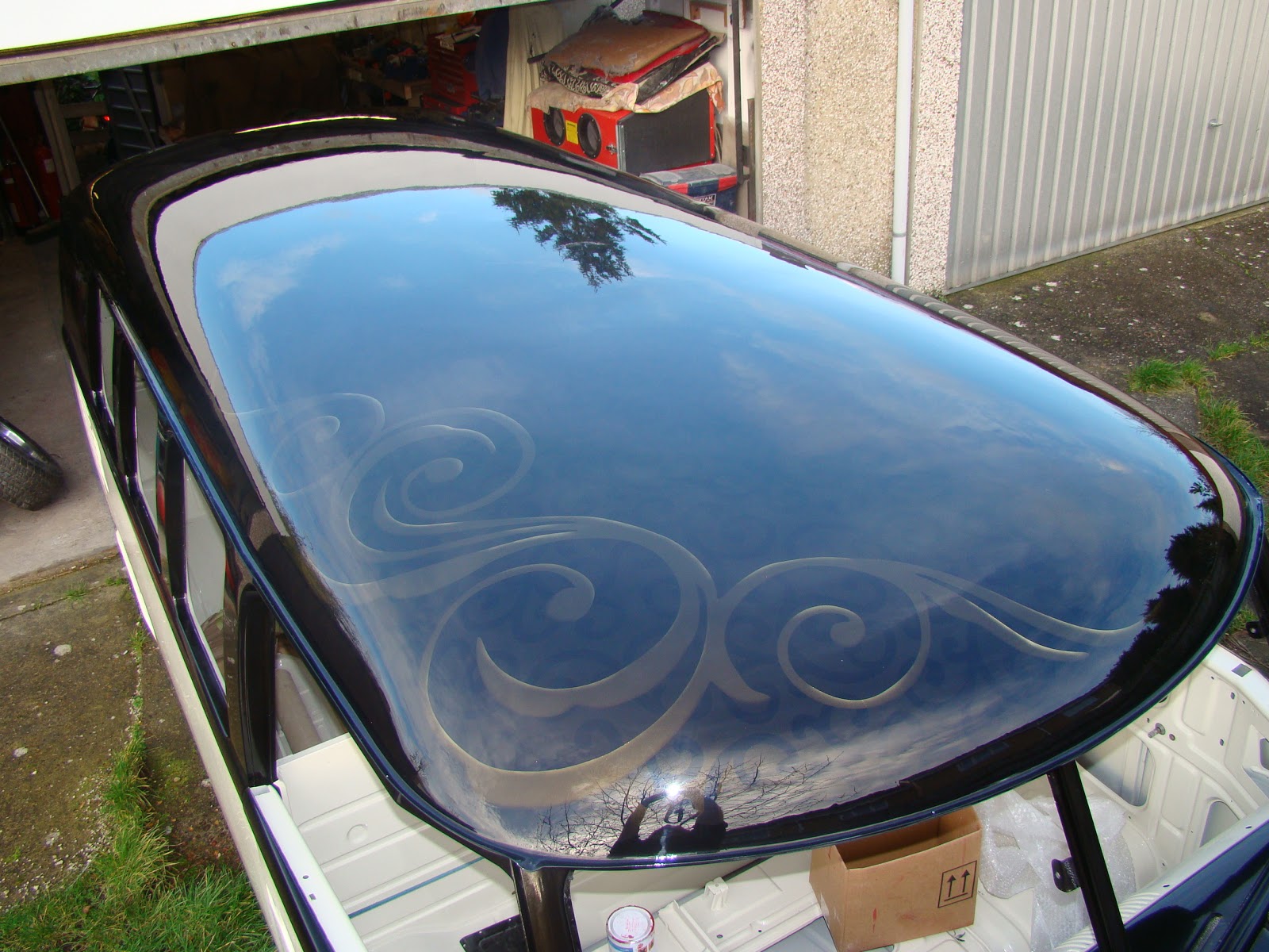
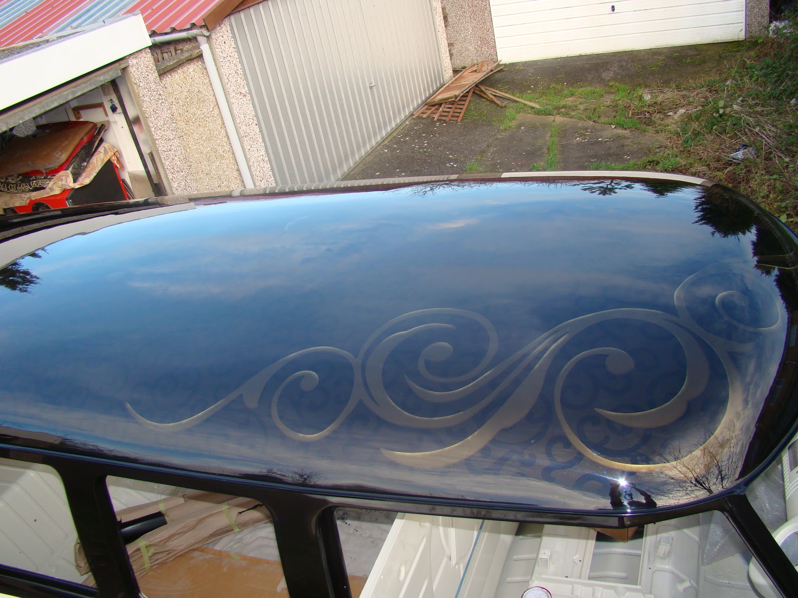
I came across a ghost flame graphic on this orange bus, this gave me the idea of making my design discrete at first glance but as you look closer the detail draws you in. The helmet shows the ghost effect on dark and light.
Deciding I preferred the darker ghost effect I realised I would need to put the graphic on the top half of the van, so I was now on the lookout for painted roofs.
I first saw a swirl pattern on a wallpaper at B and Q I liked this led me to start collecting swirl designs, from menu's, TV and even car park lifts.
I also started investigating the graphic design world this led me to deviantart.com web site. although this site was very hard to use a specific search.
I also put a few of my own ideas on paper
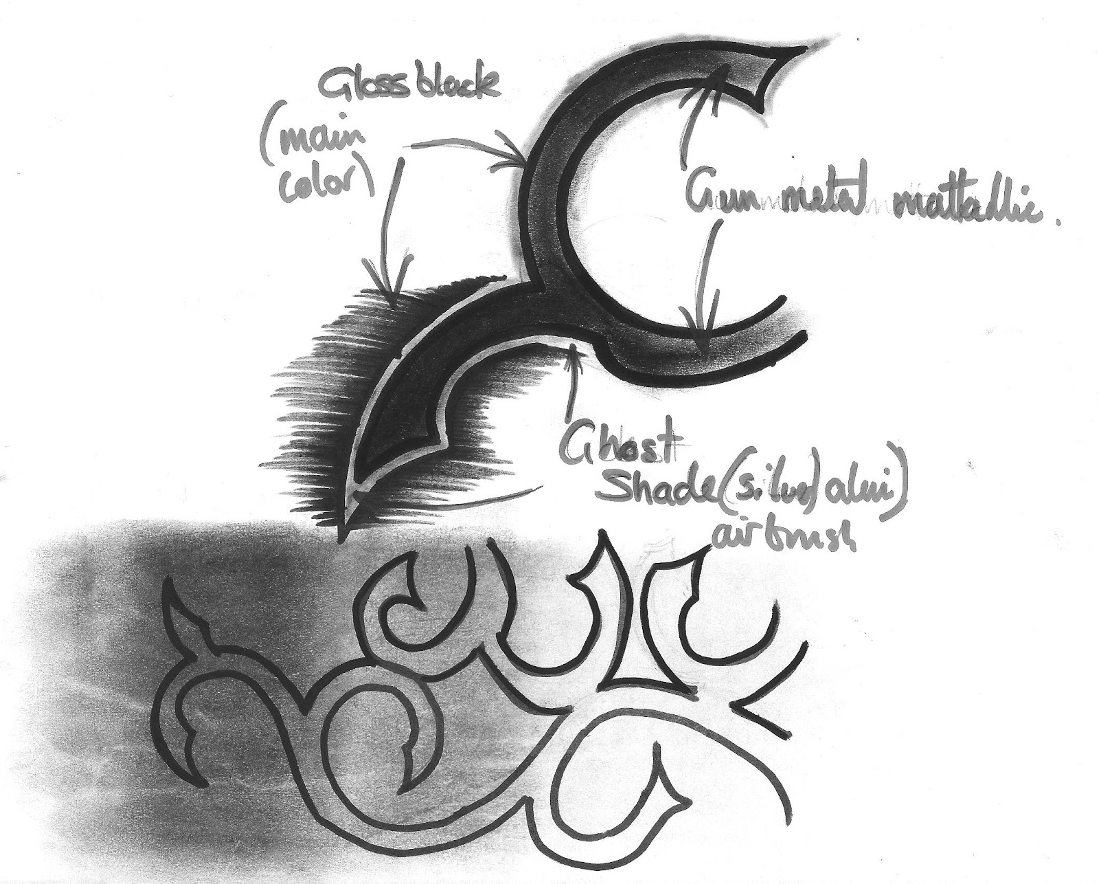
I then had to work out how I wanted the ghost effect to work, My first idea was to use a gloss black, matt black and gun metal to give the ghost effect and maybe a silver pin stripe, but could not produce this on paper.
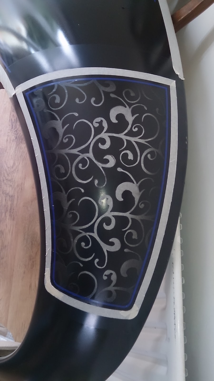
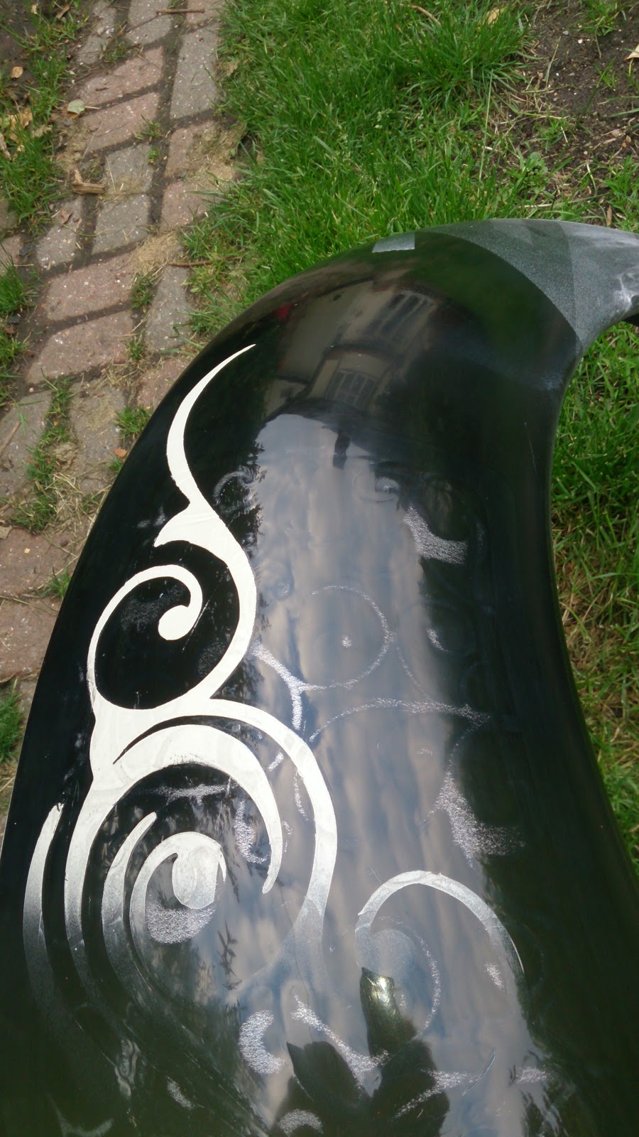
I grabbed one of the wings waiting to fit to my beetle to use as a test piece
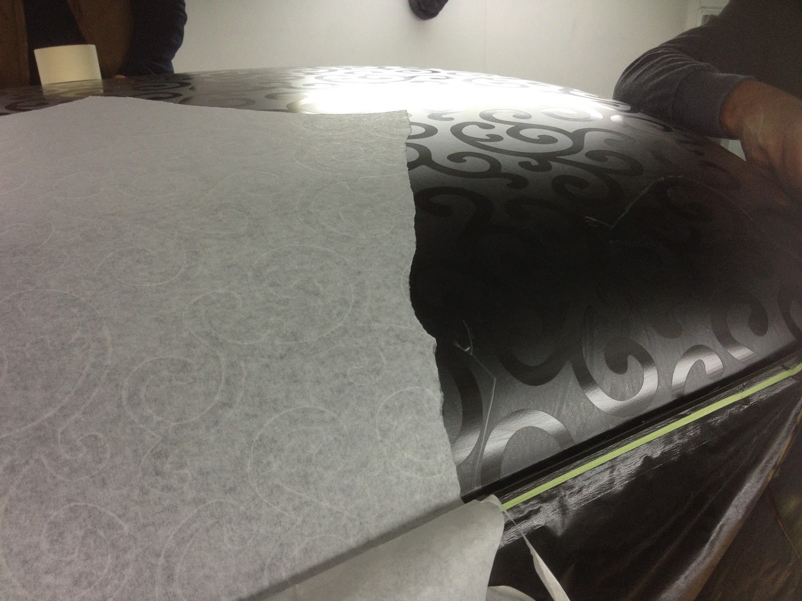
Using the matt black as a base I then taped up the wing and cut out with a scalpel a few designs.


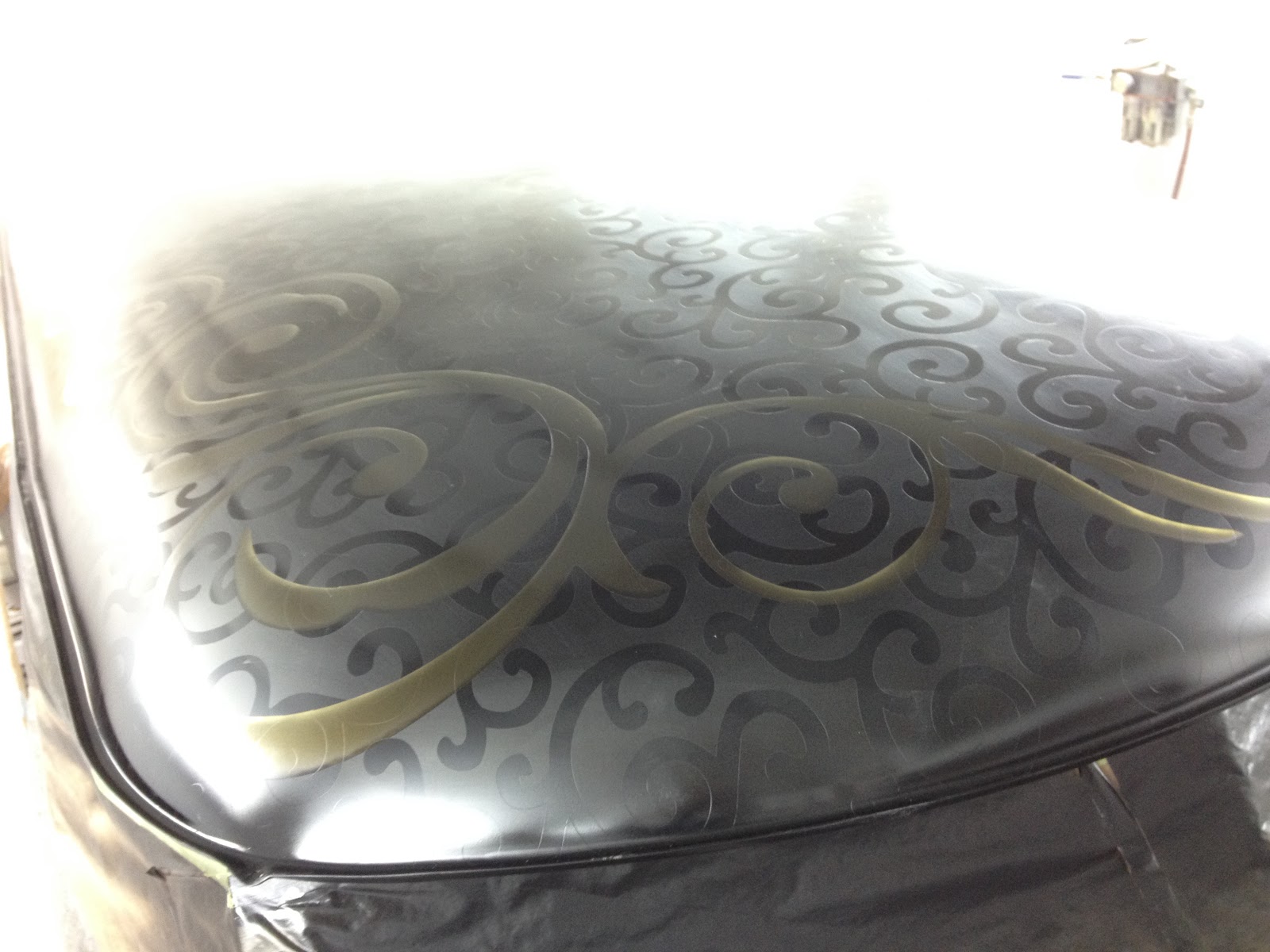
With a few back ground designs templates painted over I then cut out a larger swirl design I found on Pinterest. and then split this in a cream and black.
Pealing the second layer of tape off I realised I should have taken the first layer off before laying on the second. After a third round of taping and a few coats of lacquer and a good wet sand I got the results of my trials. I loved the black gold effect in the back ground but also discovered a matt effect would not work If I had to lacquer over the top of the design.
From the first trial I discovered the continuous swirl pattern from a clip art pattern I had used worked well, It just needed a little tweaking. I enlarged the design and then traced it to get a ruff shape of the two main individual shapes.

The two swirls were then tided up to get the thickness between the lines even and to get the curve of the swirls to look right.
The two swirls were then copied and flipped into a group of four, then positioned and gapped to make a continuous repeatable pattern.
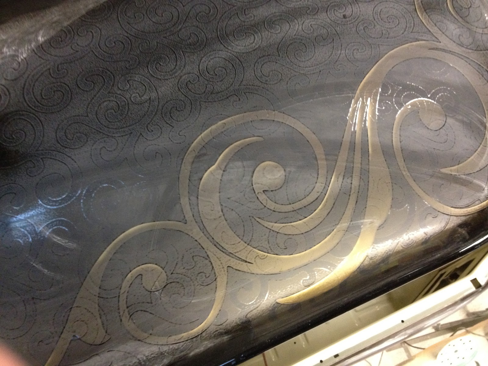
With the back ground design now decided I needed to work out the exact colour and the order they needed to be layered. I dragged out the second spare beetle wing I had and sprayed a back ground and parts of a swirl in some greys and a cream.
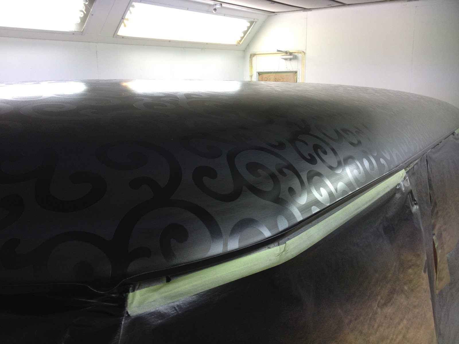
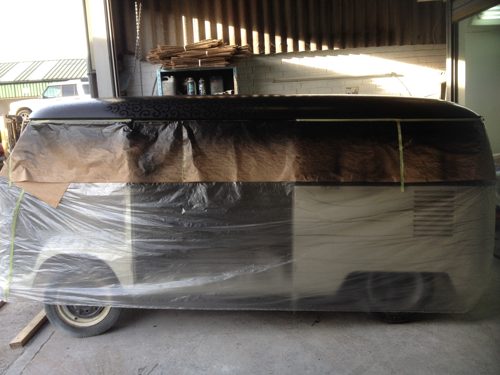
With the van now at the painters and the roof ready for paint I took the wing along to discuss the final colours. we cam to the conclusion that even trying a bit of pin striping and shading on the edges of the main design a contrasting colour to the background didn't work.
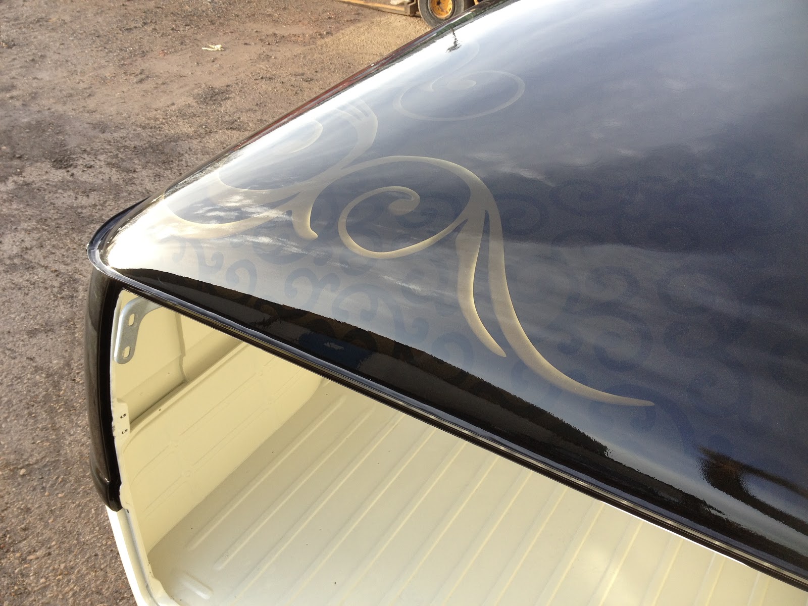
So to try and nail down the final colour for the main design I dragged the wing out again and sprayed up the back ground design for a third time, While at the paint suppliers to get the colour for the main design the paint shop gave me 100ml each of the silver and gold separate from the black that are used to make up the black gold I used in the background.
Using the paint mix print out from the paint suppliers and the digital scales I made up five shades of the black gold with different percentages of silver or gold.
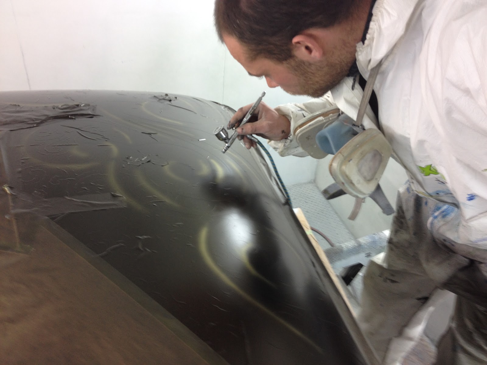
I then sprayed the main swirls with the five shades and to give the design some depth I tried shading the design with an air brush using the separate black, silver and gold in different ways,

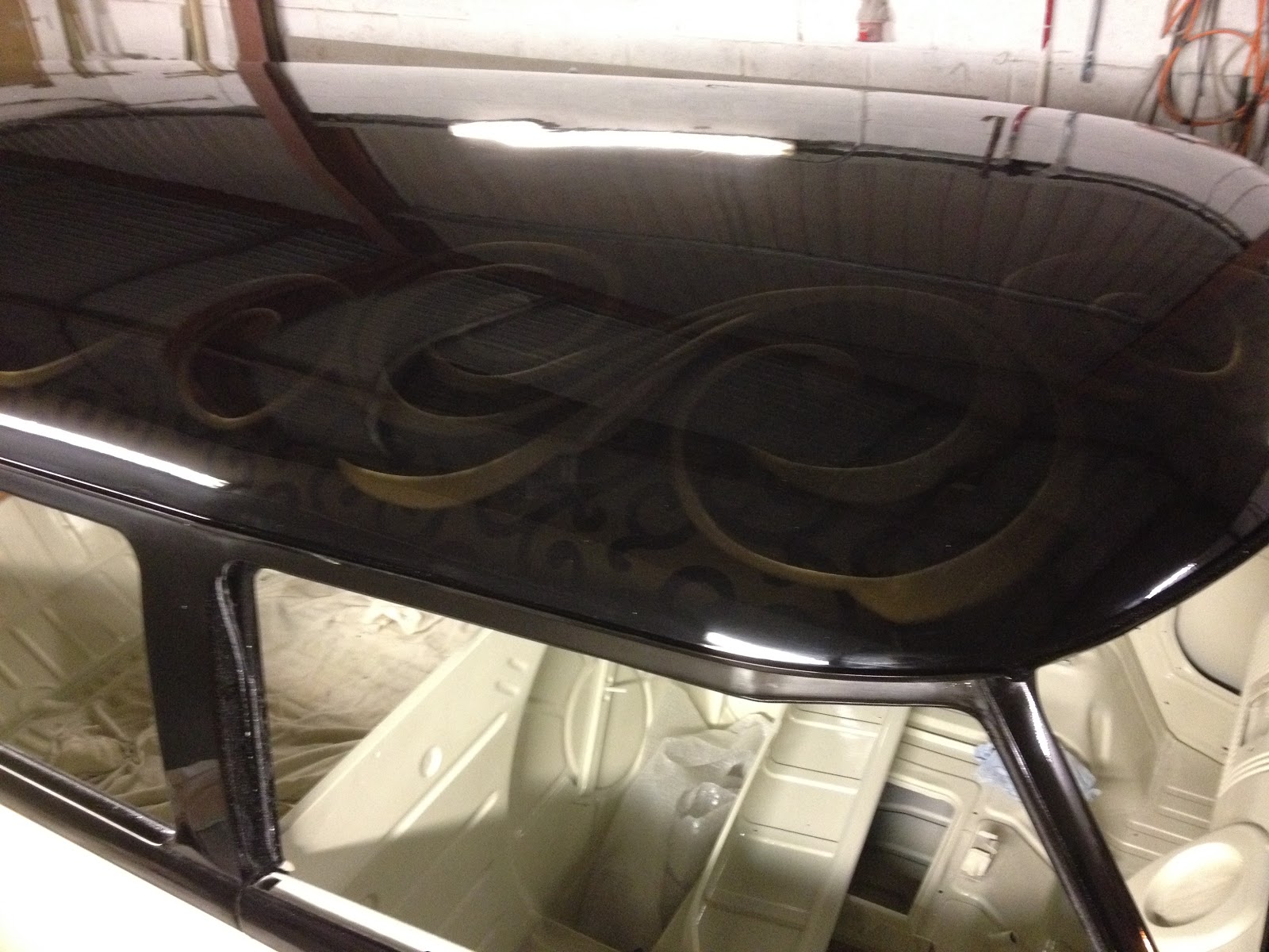
With another coat of lacquer and a wet sand and polish I felt I was finally getting closer to what I wanted to achieve. The different shades with the extra silver did not work for me and the parts with extra gold blended well in the low light and sun light conditions to produce a simular ghost effect I started out trying to achieve.
I now had to decide what shade of extra gold I wanted, and then let the painter know how to mix it. I painted five samples with 10% extra gold fleck in each. with out the lacquer you cab tell the difference between them
In direct light the five shades look the same, the black and gold low and high lights give it some depth.
With the camera flash you can see the difference in the amounts of extra gold in each. the final decision was to go with the shade second from the right that had 20% extra gold added to the original black gold.
This whole decision making process took a long time and I could not have done it with out the help from my girlfriend Rachel.